Brand system based on existing logo
Client Ask
The clients came with a logo that was created by a previous designer — the brief was to create a brand system that felt contemporary, elegant and related to their existing logo.
Thought Process
The focal point of the pre-existing logomark, the E, became the basis for the overall brand system.
End Result and Application
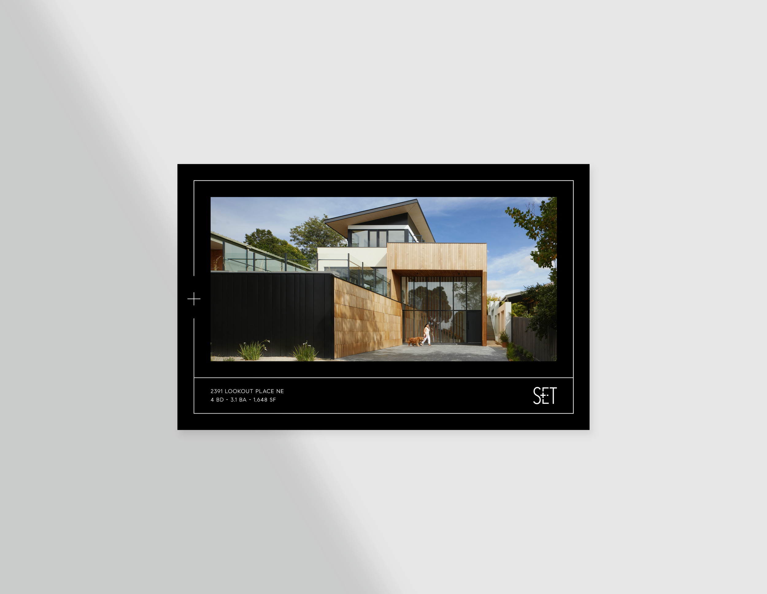
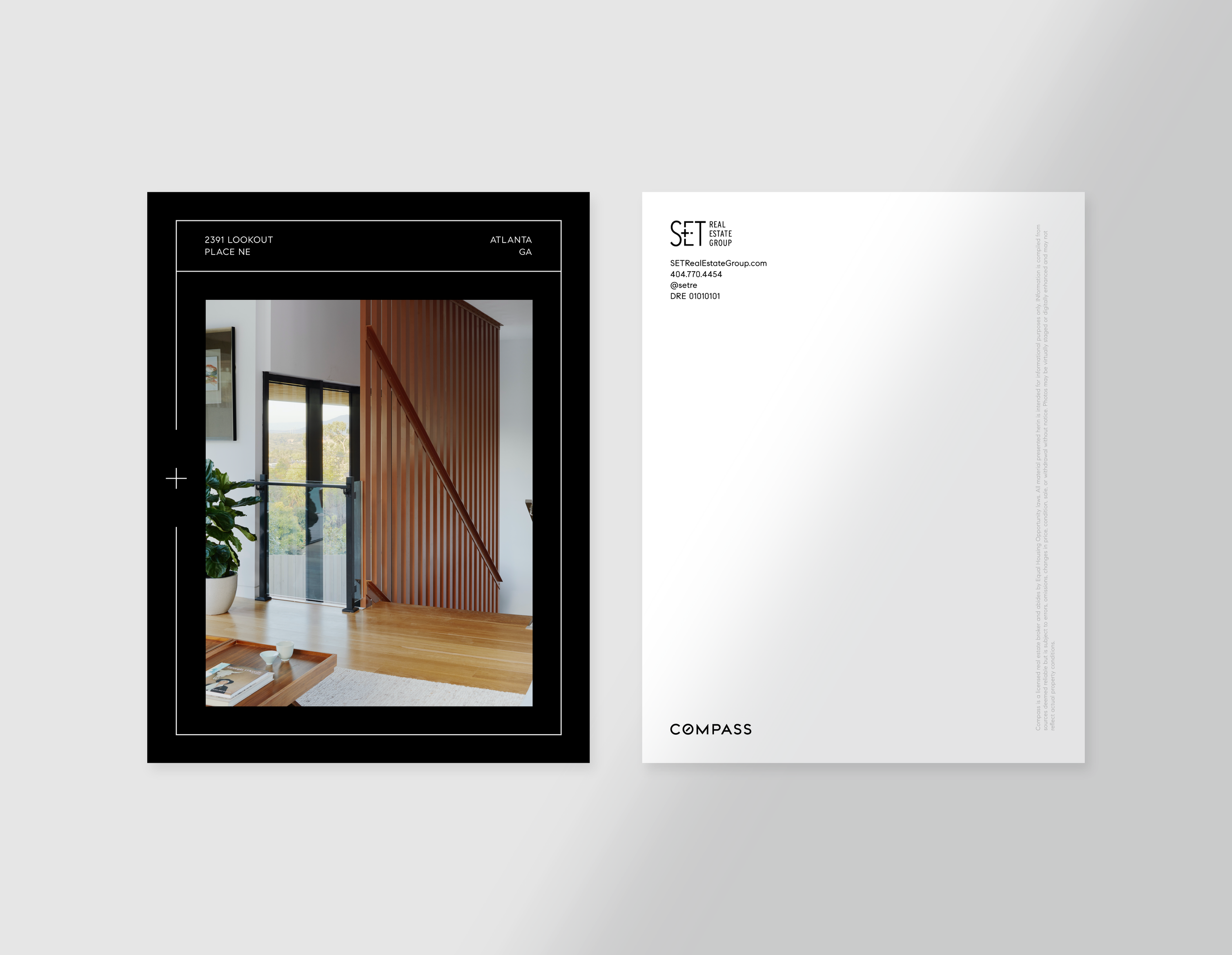
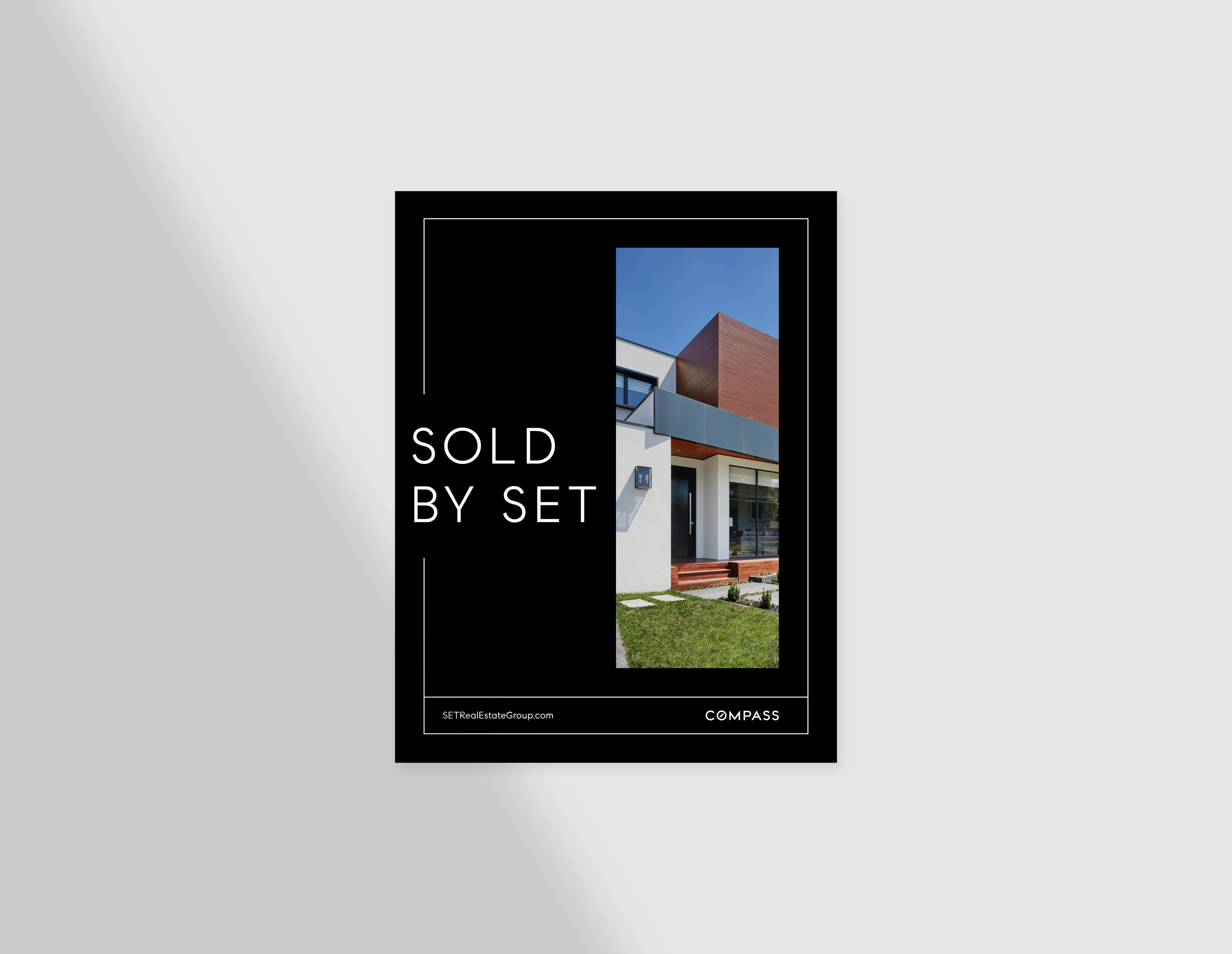
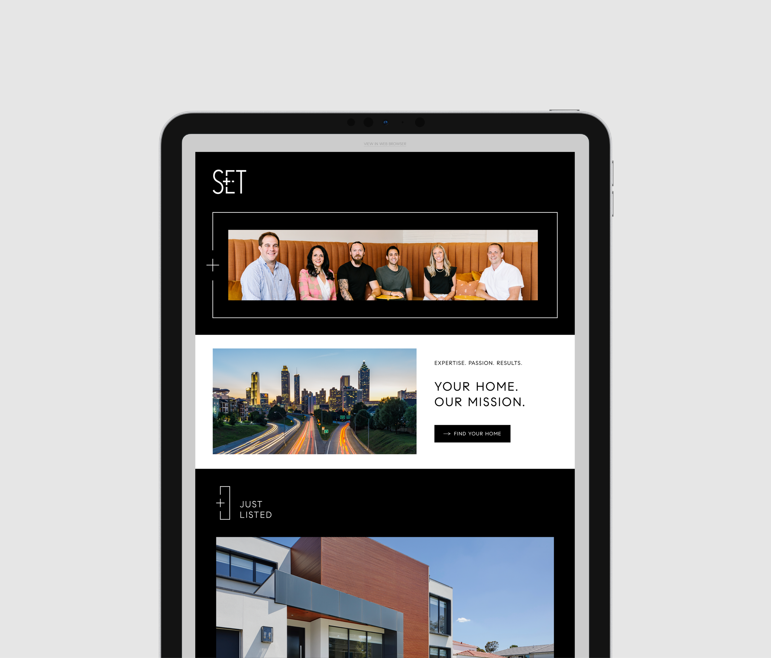
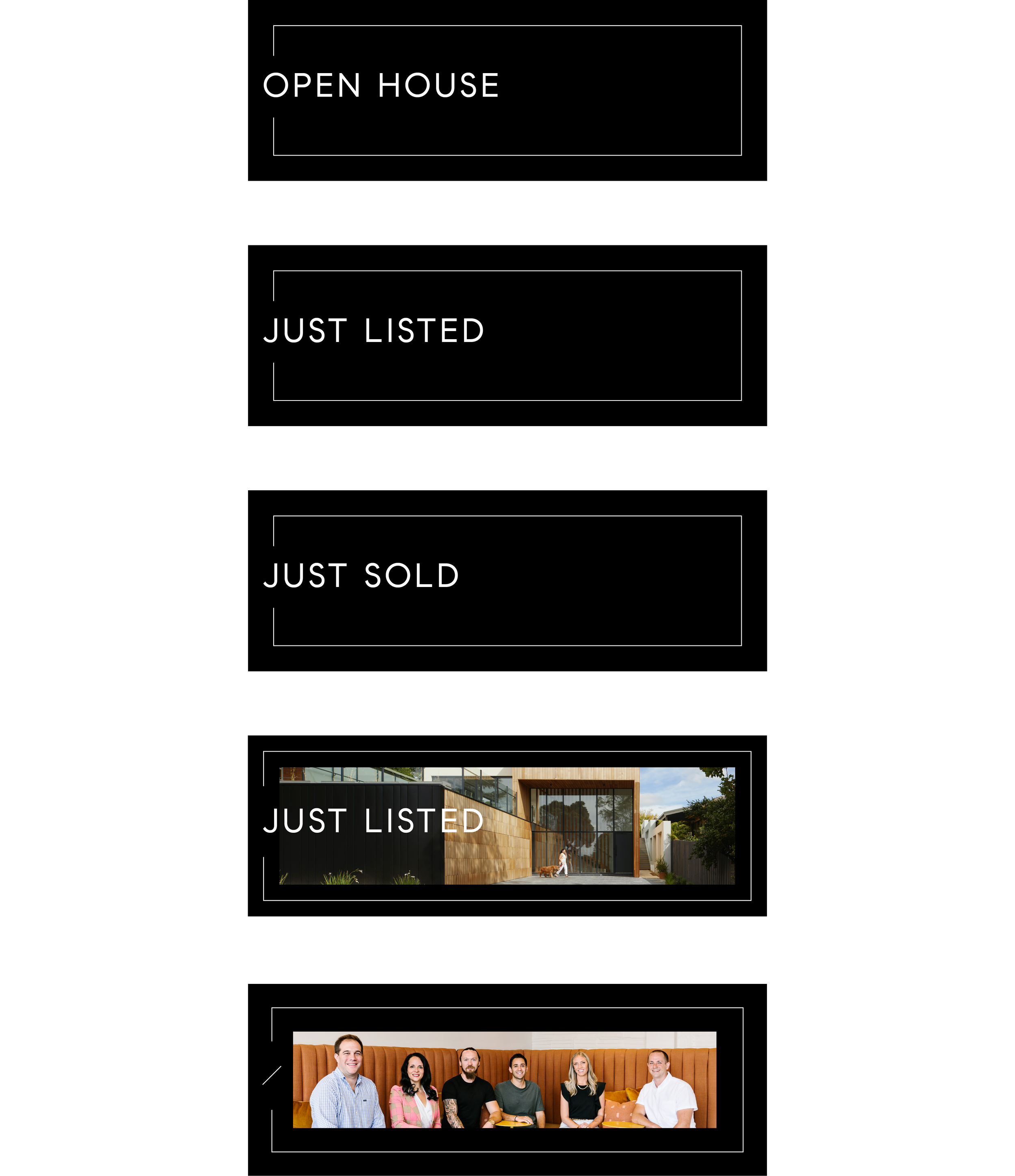
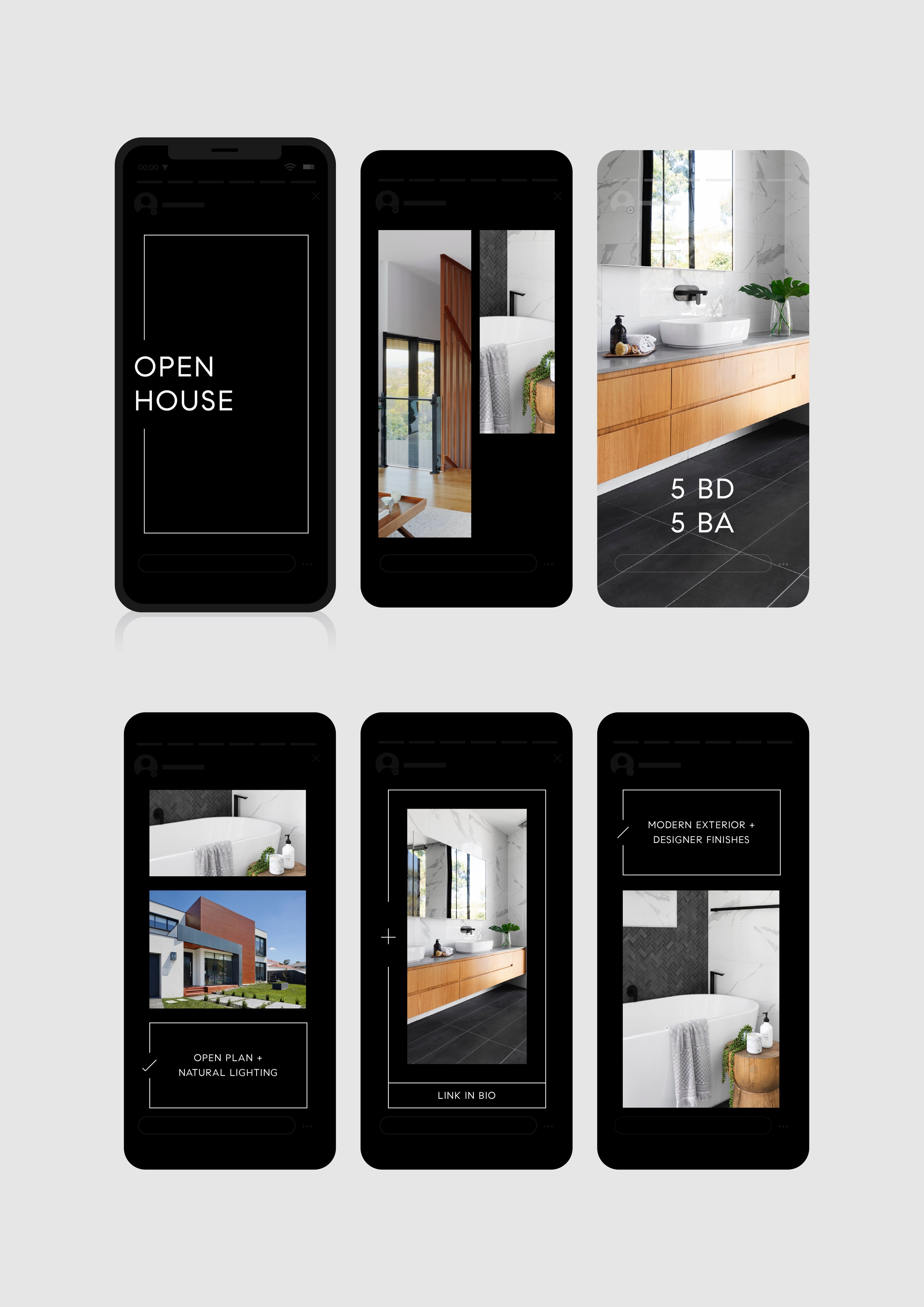
The continuous line element is used to house information; the gap in this element — similar to that in the E of the pre-existing logomark — is used for brand iconography or messaging.
Atlanta’s SET Real Estate Group found Compass’ black and white brand colors and minimal design approach agreeable. The brief, then, was to introduce an overarching element or two that was reflective of SET’s expertise and style. The group’s inclination towards a contemporary and geometric style of home helped to inform the boxy line element that’s come to be the notable aspect of their rebrand.
Project Team:
Designer | Sheba Lee
Design Manager | Laura Capps
Marketing | John Waluskiewicz
